PROJECT DESCRIPTION
PROJECT DESCRIPTION
Redesigned a web platform connecting citizens with public institutions in Rwanda. The existing prototype worked technically but failed to communicate that it was working, users could not tell if their submissions were received, being processed, or ignored. For a government platform, that ambiguity is a trust problem
Redesigned a web platform connecting citizens with public institutions in Rwanda. The existing prototype worked technically but failed to communicate that it was working, users could not tell if their submissions were received, being processed, or ignored. For a government platform, that ambiguity is a trust problem
GovTech
GovTech
INDUSTRY
INDUSTRY
Product Designer
Product Designer
ROLE
ROLE
Sept,2025
Sept,2025
YEAR
YEAR
3 Weeks
3 Weeks
DURATION
DURATION
90+
90+
SCREENS
SCREENS
THE PROBLEM
THE PROBLEM
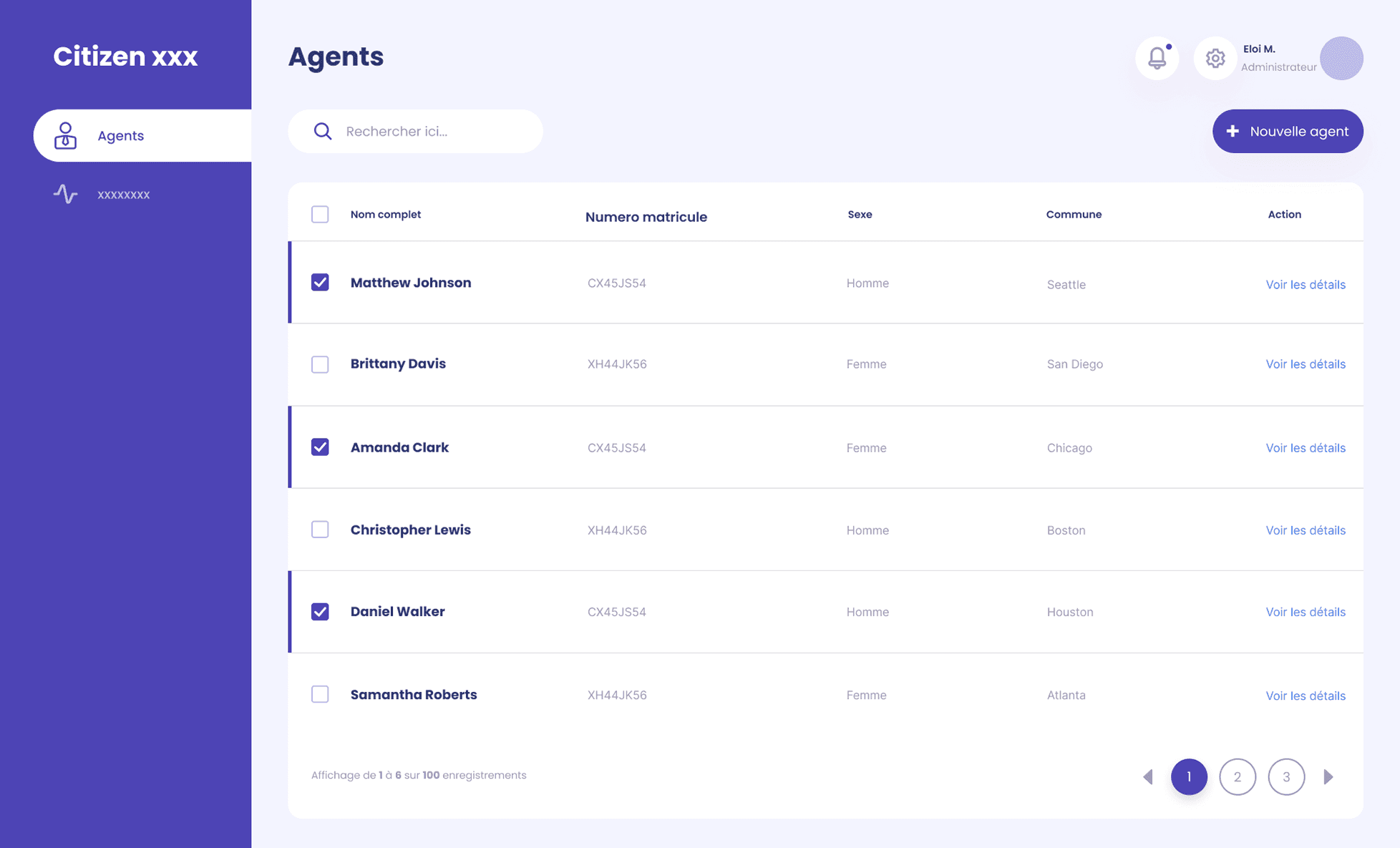
The prototype had cluttered layouts and buried navigation, but the deeper issue was absent feedback. Citizens submitting a report had no confirmation it was received. No status tracking. No signal that anything would happen. In a government context, that silence reads as indifference. The platform could not build the civic trust it was designed to create
The prototype had cluttered layouts and buried navigation, but the deeper issue was absent feedback. Citizens submitting a report had no confirmation it was received. No status tracking. No signal that anything would happen. In a government context, that silence reads as indifference. The platform could not build the civic trust it was designed to create




KEY DECISIONS
KEY DECISIONS
I prioritized feedback visibility over information density. Every submission now generates a visible confirmation. Every report has a trackable status. I reduced navigation to three top-level paths, the minimum needed for a citizen of any literacy level to complete their core task without help. Less on each screen. Users always know what happens next
I prioritized feedback visibility over information density. Every submission now generates a visible confirmation. Every report has a trackable status. I reduced navigation to three top-level paths, the minimum needed for a citizen of any literacy level to complete their core task without help. Less on each screen. Users always know what happens next
SOLUTION
SOLUTION
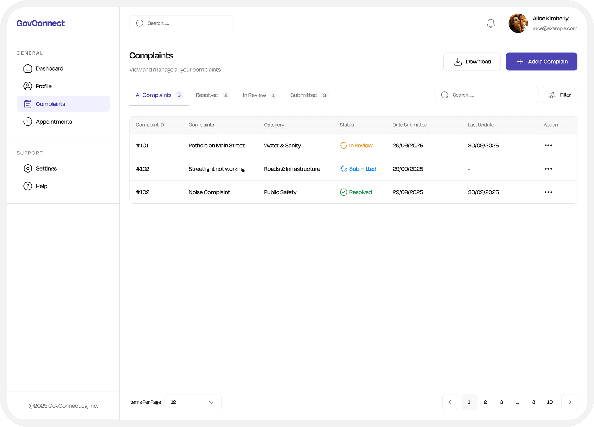
Redesigned layouts with clear hierarchy surfacing reporting and tracking actions. Consistent typography system. Simplified navigation. Explicit confirmation feedback at every stage of a submission lifecycle
Redesigned layouts with clear hierarchy surfacing reporting and tracking actions. Consistent typography system. Simplified navigation. Explicit confirmation feedback at every stage of a submission lifecycle




IMPACT
IMPACT
Path to primary action reduced from 4+ steps to 2. Submission feedback visible at every stage. Designed for varying digital literacy across citizen base. Brand identity maintained throughout. Fully developed and delivered in 3 weeks with a team of 4
Path to primary action reduced from 4+ steps to 2. Submission feedback visible at every stage. Designed for varying digital literacy across citizen base. Brand identity maintained throughout. Fully developed and delivered in 3 weeks with a team of 4
ALL RIGHTS RESERVED
ALL RIGHTS RESERVED
2025
2025